In the digital age, it’s crucial for websites to adapt seamlessly to various screen sizes and devices. A responsive web layout ensures that your site looks and functions well across desktops, tablets, and smartphones. In this tutorial, we’ll walk through the process of building a responsive web layout using HTML, CSS, and JavaScript.
1. HTML Structure
<!DOCTYPE html>
<html lang="en">

<head>
    <meta charset="UTF-8">
    <title>How to Create a Responsive Website Layout</title>
    <link rel="stylesheet" href="style.css">
</head>
<body>
    <header>
        <nav>
            <img class="logos" src="https://www.wizbrand.com/assets/images/wiz.webp" alt="">
            <div class="logo">
                <h5>Wizbrand</h5>
            </div>
            <ul class="menu">
                <li><a href="#">Home</a></li>
                <li><a href="#">About</a></li>
                <li><a href="#">Portfolio</a></li>
                <li><a href="#">Services</a></li>
                <li><a href="#">Contact</a></li>
            </ul>
            <div class="bar">
                <div class="bar-1"></div>
                <div class="bar-2"></div>
                <div class="bar-3"></div>
            </div>
        </nav>
    </header>
    <div class="banner">
        <div class="wrapper">
            <div class="content">
                <h2>Digital Agency</h2>
                <p>Lorem ipsum dolor sit amet consectetur adipisicing elit Soluta</p>
                <div class="btn">
                    <a href="#">Learn More</a>
                    <a href="#">Sign up</a>
                </div>
            </div>
        </div>
    </div>


    <script>
        const X = () => {
            const menu = document.querySelector('.bar');
            const nav = document.querySelector('.menu');

            menu.addEventListener('click', () => {
               menu.classList.toggle('bar-active');
                nav.classList.toggle('nav-active');
            });
        }
        X();
    </script>
</body>
</html>
2. CSS Styling
* {
    margin: 0;
    padding: 0;
    box-sizing: border-box;
    font-family: sans-serif;
}
nav {
    display: -webkit-flex;
    display: -moz-flex;
    display: -ms-flex;
    display: -o-flex;
    display: flex;
    justify-content: space-around;
    align-items: center;
    min-height: 10vh;
    background: #fff;
}
.logo {
    color: #141733;
    text-transform: capitalize;
    font-size: 24px;
    cursor: pointer;
    font-weight: 900;
    letter-spacing: 1px;
}
.menu {
    display: -webkit-flex;
    display: -moz-flex;
    display: -ms-flex;
    display: -o-flex;
    display: flex;
    justify-content: space-around;
    width: 30%;
}
.menu li {
    list-style: none;
}
.menu a {
    color: #141733;
    text-decoration: none;
    font-size: 15px;
    padding: 30px;
    font-weight: 600;
}
.menu a:hover {
    color: #ff6138;
    transition: .6s;
}
.bar {
    display: none;
    cursor: pointer;
}
.bar div {
    width: 25px;
    height: 3px;
    background-color: #ff6138;
    margin: 5px;
    transition: all .5s ease;
}
@media screen and (max-width:1024px) {
    .menu {
        width: 60%;
    }
    .menu a {
        color: #fff;
    }
}
@media screen and (max-width:768px) {
    body {
        overflow-x: hidden;
    }
    .menu {
        position: absolute;
        right: -100%;
        height: 90vh;
        top: 10vh;
        background-color: #000;
        display: flex;
        flex-direction: column;
        align-items: center;
        width: 100%;
        transform: translateX(100%);
        transition: transform 0.5s ease-in-out;
        opacity: .9;
    }
    .bar {
        display: block;
    }
    .menu a {
        color: #fff;
    }
}
.nav-active {
    transform: translateX(-100%);
}
.bar-active .bar-1 {
    transform: rotate(-45deg) translate(-5px, 6px);
}
.bar-active .bar-2 {
    opacity: 0;
}
.bar-active .bar-3 {
    transform: rotate(45deg) translate(-5px, -6px);
}
.banner {
    background-image: url(2.jpg);
    height: 100vh;
    background-size: cover;
    background-position: center;
}
.content h2 {
    color: #fff;
    font-size: 60px;
    font-weight: 900;
}
.content p {
    width: 50%;
    color: #fff;
    line-height: 2;
    margin: auto;
}
.btn a {
    text-decoration: none;
    background: #ff6138;
    padding: 15px 10px;
    display: inline-block;
    color: #fff;
    margin-top: 15px;
    border-radius: 50px;
    width: 130px;
    text-align: center;
}
.wrapper {
    width: 1060px;
    margin: auto;
    padding-top: 12%;
}
.content {
    text-align: center;
}
@media only screen and (min-width: 768px) and (max-width: 991px) {
    .wrapper {
        width: 75%;
        padding-top: 26%;
    }
    .content {
        text-align: center;
    }
    .content h2 {
        font-size: 60px;
    }
    .content p {
        width: 100%;
    }
}
@media screen and (max-width: 767px) {
    .banner {
        background-position: 60%;
    }
    .wrapper {
        width: 75%;
        padding-top: 26%;
    }
    .content h2 {
        font-size: 25px;
    }
    .content p {
        width: 100%;
    }
    .btn a {
        padding: 9px 4px;
        width: 105px;
    }
}
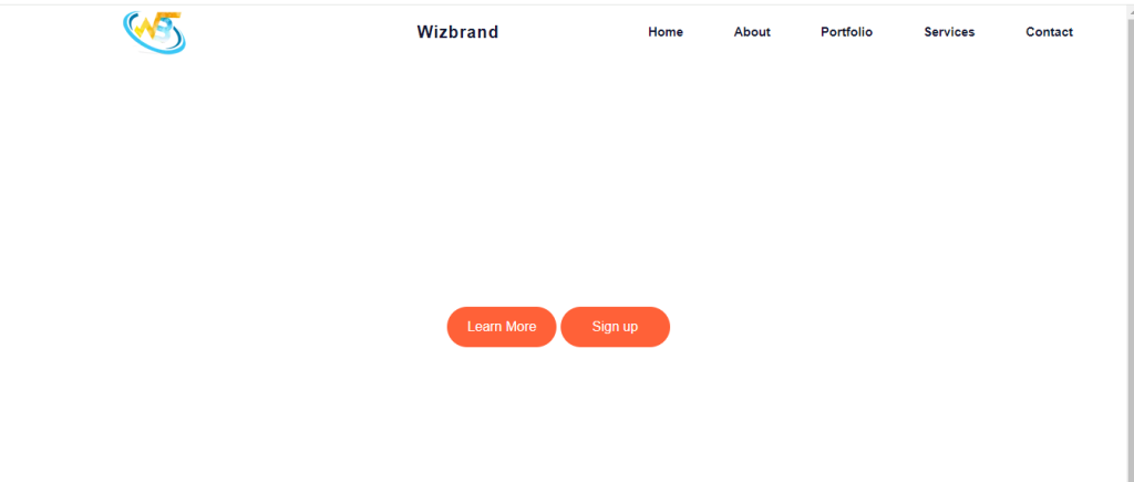
Output:-
Hopefully, It will help you …!!!
