Introduction
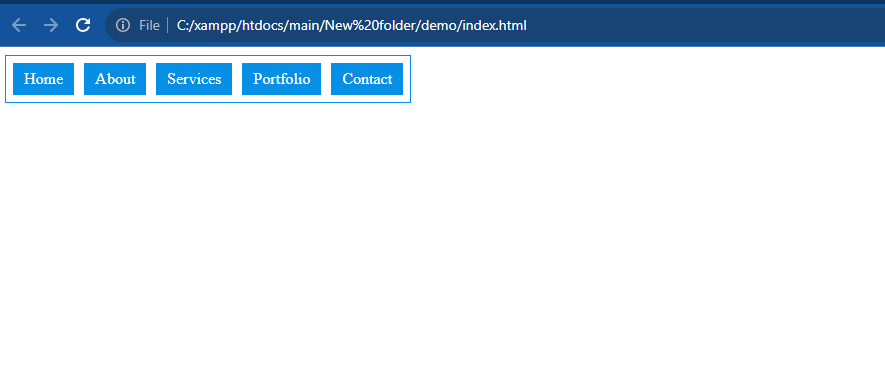
In this tutorial, we will learn how to create a responsive menu in HTML/PHP. A responsive menu is an essential part of any website as it allows users to navigate through different pages or sections easily. We will also provide a live example to demonstrate the implementation of a responsive menu.
Step 1: HTML Markup
<html>
    <head>
        <title>Responsive Menu</title>
        <meta name="viewport" content="width=device-width, initial-scale=1">
        <link rel="stylesheet" type="text/css" href="css/style.css">
        <script src="http://ajax.googleapis.com/ajax/libs/jquery/1/jquery.min.js"></script>
        <link rel="stylesheet" href="style.css">
    </head>
    <body>
        <div class="mobile-menu" id="mobile-menu">
            Menu
            <img src="http://www.shoredreams.net/wp-content/uploads/2014/02/show-menu-icon.png">
        </div>
        <nav>
            <ul>
                <li>
                    <a href="#">Home</a>
                </li>
                <li>
                    <a href="#">About</a>
                </li>
                <li>
                    <a href="#">Services</a>
                </li>
                <li>
                    <a href="#">Portfolio</a>
                </li>
                <li>
                    <a href="#">Contact</a>
                </li>
            </ul>
        </nav>
        <script type="text/javascript">
	$(function() {
        var pull = $('#mobile-menu');
        menu = $('nav ul');
        menuHeight = menu.height();
        $(pull).on('click', function(e) {
            e.preventDefault();
            menu.slideToggle();
        });
        $(window).resize(function() {
            var w = $(window).width();
            if (w > 320 && menu.is(':hidden')) {
                menu.removeAttr('style');
            }
        });
    });
        </script>
    </body>
</html>
Step 2:- Create CSS Page
nav ul{
padding: 2px;
margin: 0px;
position: absolute;
background-color: #fff;
border: 1px solid #078EE5;
}
nav ul li{
margin: 5px;
float: left;
list-style: none;
line-height: 30px;
position: relative;
border: 1px solid #078EE5;
background-color: #078EE5;
}
nav ul li:hover{
margin: 5px;
color: #078EE5;
background-color: #fff;
border: 1px solid #078EE5;
}
nav ul li:hover > a{
color: #078EE5;
}
nav ul li a{
color: #fff;
padding: 10px;
text-decoration: none;
}
.mobile-menu{
background-color: red;
position: relative;
display: none;
}
@media (max-width: 640px) {
.mobile-menu{
display: block;
background-color: #078EE5;
color: #fff;
padding: 5px 10px;
cursor: pointer;
}
.mobile-menu img{
width: 25px;
top: 2px;
right: 10px;
position: absolute;
}
nav{
position: relative;
height: auto;
}
nav ul{
display: none;
list-style: none;
padding: 0;
margin: 0;
width: 99%;
top: 0;
position: absolute;
}
nav ul li{
width: 92%;
position: relative;
padding: 5px;
background-color: #078EE5;
cursor: pointer;
}
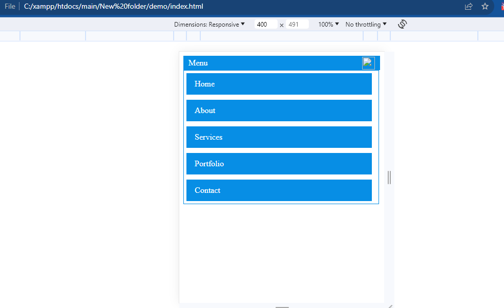
}Output:- In mobile view
Hopefully, It will help you…!!!