In web development, animations can enhance the user experience by adding a touch of interactivity and visual appeal to elements on a webpage. In this tutorial, we’ll explore how to create a simple yet elegant animation for form input labels using only CSS.
HTML Structure
<!DOCTYPE html>
<html lang="en">

<head>
    <meta charset="UTF-8">
    <meta http-equiv="X-UA-Compatible" content="IE=edge">
    <meta name="viewport" content="width=device-width, initial-scale=1.0">
    <title>Form Design with Input label animation-wizbrand</title>
    <link rel="stylesheet" href="style.css">
</head>
<body>
    <div class="wrapper">
        <form>
            <div class="content">
              <input type="text" name="" required="">
              <label>Your Full Name</label>
            </div>
            <div class="content">
              <input type="email" name="" required="">
              <label>Your Email Address</label>
            </div>
            <div class="content">
              <input type="text" name="" required="">
              <label>Your Username</label>
            </div>
            <div class="content">
              <input type="password" name="" required="">
              <label>Your Password</label>
            </div>
            <a href="#" id="btn">Submit</a>
        </form>
    </div>
</body>
</html>
CSS Styles
html {
    height: 100%;
}
body {
    margin: 0;
    padding: 0;
    font-family: sans-serif;
    background: #0fc5e1;
}
.wrapper {
    position: absolute;
    top: 50%;
    left: 50%;
    width: 350px;
    padding: 40px;
    transform: translate(-50%, -50%);
    background: #e8fbff;
    box-sizing: border-box;
    box-shadow: 0 15px 25px rgba(0, 0, 0, .6);
    border-radius: 10px;
    height: 450px;
}
.content {
    position: relative;
}
.content input {
    width: 100%;
    padding: 10px 0;
    font-size: 16px;
    color: #262626;
    margin-bottom: 30px;
    border: none;
    border-bottom: 2px solid #262626;
    outline: none;
    background: transparent;
}
.content label {
    position: absolute
    top: 0;
    left: 0;
    padding: 10px 0;
    font-size: 16px;
    color: #262626;
    pointer-events: none;
    transition: .5s;
}
.content input:focus~label,
.content input:valid~label {
    top: -20px;
    left: 0;
    color: #101010;
    font-size: 12px;
    font-weight: 700;
}
#btn {
    background: linear-gradient(45deg, #0191aa, #0fc6e0);
    text-decoration: none;
    color: #fff;
    padding: 15px 0;
    display: block;
    text-align: center;
    margin-top: 3%;
    font-size: 13px;
    letter-spacing: 3px;
}
Output:-
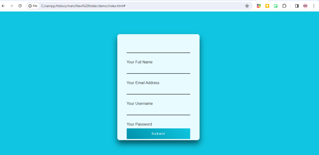
Hopefully, It will help you …!!!