Creating responsive images with aspect ratio without using media queries can be achieved using a combination of CSS Flexbox and the aspect-ratio property. Here’s how you can do it:
Step #1:- Html Page
<!DOCTYPE html>
<html lang="en">
<head>
<meta charset="UTF-8">
<meta name="viewport" content="width=device-width, initial-scale=1.0">
<title>Responsive Images with Aspect Ratio</title>
<style>
  .image-container {
    display: flex;
    justify-content: center;
    align-items: center;
    overflow: hidden;
  }

  .image-container img {
    width: 100%;
    height: auto;
    object-fit: cover;
    aspect-ratio: 16 / 9; /* Change the aspect ratio as needed */
  }
</style>
</head>
<body>
  <div class="image-container">
    <img src="image.jpg" alt="Example Image">
  </div>
</body>
</html>
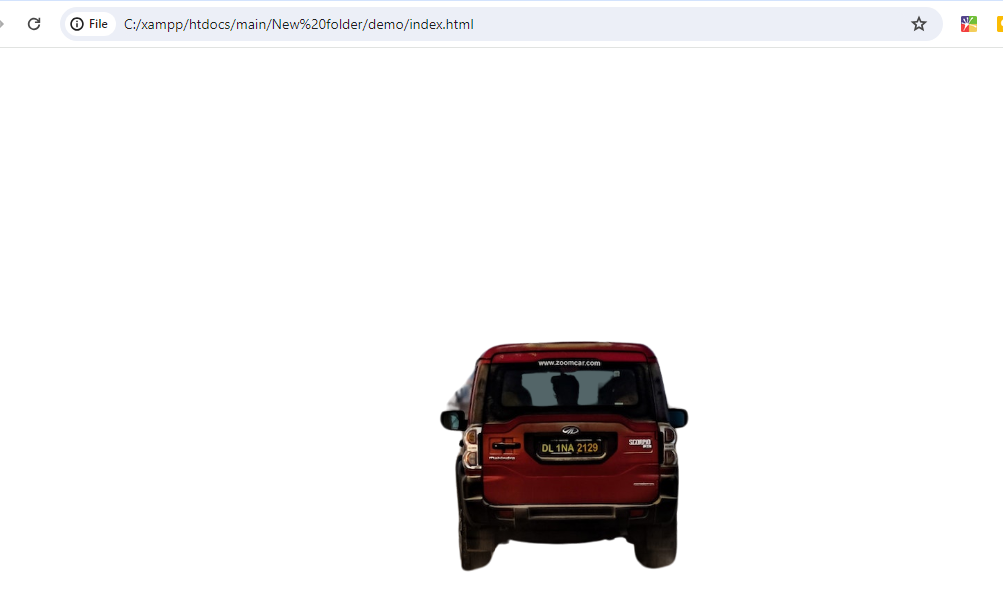
Output:-
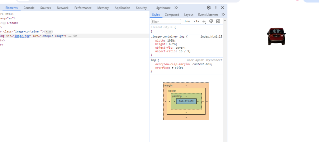
Output 2:-
Hopefully, It will help you …!!!