In the world of web development, understanding the nuances of CSS properties is crucial for creating visually appealing and responsive layouts. Two commonly used properties for setting the height of elements are height: 100% and height: 100vh. While they might seem similar at first glance, they have distinct behaviors and use cases. Let’s explore the difference between them in this blog post.

Height: 100%
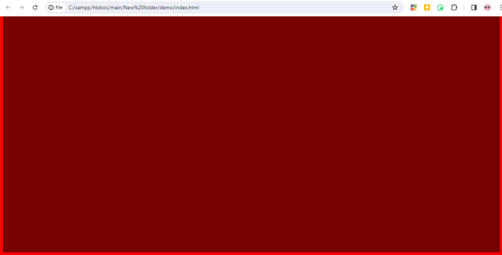
When you set height: 100% on an element, you’re instructing it to take up 100% of the height of its containing element. This means that the element will expand or contract based on the height of its parent container. However, there’s a caveat – the parent container must have an explicit height defined for height: 100% to work correctly. If the parent’s height is not specified, the browser doesn’t have a reference for what “100%” means, and the height won’t be applied as expected.
<!DOCTYPE html>
<html lang="en">
<head>
    <meta charset="UTF-8">
    <meta name="viewport" content="width=device-width, initial-scale=1.0">
    <title>Document</title>
    <style>
        body {
            background: red;
            height: 5000px;
        }
        .container {
            background: rgba(0, 0, 0, 0.534);
            width: 100%;
            /* height: 100vh; */
            height: 100%;
        }
    </style>
</head>
<body>
    <div class="container">

    </div>
</body>
</html>
One common scenario where height: 100% is used is in creating flexible layouts, such as equal-height columns within a grid or a container that needs to stretch to fill the entire viewport. It’s worth noting that when using height: 100%, you may encounter issues with nested elements or situations where the parent’s height is dynamic or not explicitly defined.
Output:-
Height: 100vh
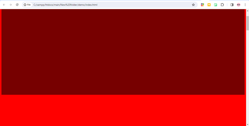
On the other hand, height: 100vh sets the height of an element to occupy 100% of the viewport height, regardless of its parent’s dimensions. The “vh” unit represents a percentage of the viewport height, where 100vh is equal to 100% of the viewport height.
<!DOCTYPE html>
<html lang="en">
<head>
    <meta charset="UTF-8">
    <meta name="viewport" content="width=device-width, initial-scale=1.0">
    <title>Document</title>
    <style>
        body {
            background: red;
            height: 5000px;
        }
        .container {
            background: rgba(0, 0, 0, 0.534);
            width: 100%;
            height: 100vh;
            /* height: 100%; */
        }
    </style>
</head>
<body>
    <div class="container">

    </div>
</body>
</html>
Using height: 100vh is particularly useful for creating full-screen sections or elements that should cover the entire height of the browser window. It ensures that the element spans the entire height of the viewport, regardless of the structure of the document or the dimensions of its parent containers.
Output:-
Hopefully, It will help you …!!!