Introduction
Welcome to TheDataOps.org! In modern data environments, systems have grown remarkably complex. Today’s data architectures often contain multiple data sources, ETL/ELT pipelines, cloud storage buckets, enterprise data warehouses, transformation workflows, business intelligence dashboards, and various automated jobs running around the clock. When these systems grow intricate, data teams need a centralized way to understand whether their data workflows remain healthy. A monitoring dashboard acts as a visual operational layer that helps teams see important operational information in one place, preventing small pipeline glitches from turning into major business crises. For deeper guides and engineering resources, you can explore TheDataOps.org.
What Is DataOps?
DataOps is an operational approach that combines data engineering, automation, testing, monitoring, collaboration, quality management, and continuous improvement.
The primary goal of DataOps is to make data delivery more reliable, repeatable, visible, and efficient. By applying agile principles and automated testing to data workflows, teams can catch errors early and deliver trusted data faster. DataOps is not merely a monitoring tool; it is an overarching engineering culture and operational practice.
What Is a DataOps Monitoring Dashboard?
A DataOps monitoring dashboard is a centralized visual interface that presents operational information about data pipelines and data platforms.
Dashboards combine information from multiple sources, including pipeline orchestrators, databases, cloud data warehouses, cloud platforms, monitoring systems, and data quality tools. They pull together logs, metrics, traces, metadata, and quality signals into actionable visualizations that help teams understand their data environment at a glance.
Why Monitoring Dashboards Matter in DataOps
Without a centralized dashboard, data teams often discover broken pipelines only when business users complain about missing reports. Teams frequently struggle with pipeline failures, delayed data, stale datasets, silent data quality issues, unexpected schema changes, processing bottlenecks, and escalating cloud costs.
Too many fragmented alerts can also overwhelm engineers. Dashboards turn scattered operational information into a coherent, understandable view, allowing teams to prioritize issues and maintain reliable data delivery.
Key Metrics Every DataOps Dashboard Should Track
Pipeline Success Rate
Tracking successful versus failed pipeline runs helps teams spot unstable jobs. A sudden spike in failures signals an underlying code bug, connection timeout, or schema mismatch.
Data Freshness
Data freshness monitoring checks whether datasets arrive within their expected timeframe. If a daily sales table fails to update by 6:00 AM, the dashboard highlights the delay immediately.
Pipeline Runtime
Changes in processing duration can reveal performance degradation. If a transformation job normally takes 15 minutes but suddenly takes two hours, engineers can investigate before it times out.
Data Quality
Quality checks assess completeness, validity, accuracy indicators, duplicate records, missing values, and schema consistency. Catching null values or unexpected data types early prevents downstream reporting errors.
Error Rate
Recurring error logs can reveal unstable workflows or failing API integrations that require code refactoring.
Data Volume
Unexpected changes in row counts or file sizes—such as a sudden drop to zero rows—can indicate ingestion failures or source-system issues.
Cost
Tracking cloud and compute costs alongside operational health helps teams manage resource consumption and avoid unexpected cloud spending spikes.
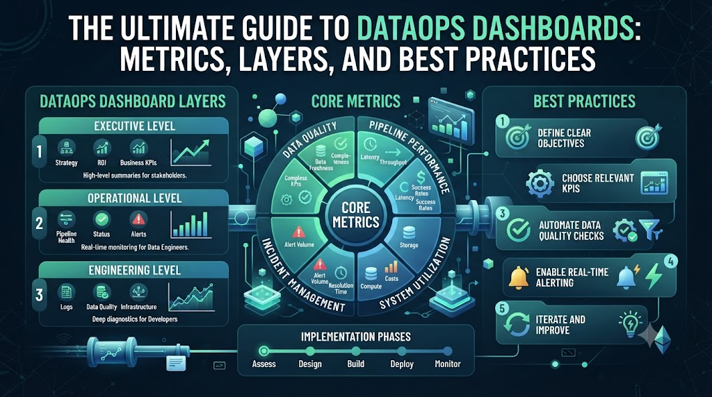
Monitoring Dashboard Layers
Not every user in an organization needs the same level of detail. Effective dashboard design often incorporates three distinct layers:
Executive Layer
- Overall reliability
- Business-impacting incidents
- SLO (Service Level Objective) health
- Data quality trends
- Cost trends
Operational Layer
- Pipeline health
- Failed jobs
- Freshness status
- Active alerts
- Workflow status
Engineering Layer
- Query latency
- Raw logs
- Execution traces
- Schema changes
- Resource usage
- Detailed error messages
Monitoring vs. Data Observability
It is helpful to distinguish between basic monitoring and advanced data observability.
Monitoring answers the fundamental question: “Is something wrong?” It tracks predefined thresholds and triggers alerts when a metric goes out of bounds.
Observability goes a step further, helping answer: “Why is it wrong, and what systems or data assets are connected to it?” Observability combines metrics, logs, traces, metadata, lineage, and quality signals to provide the deep context required for complex troubleshooting.
Role of Data Lineage in Monitoring Dashboards
Data lineage traces the journey of data through its lifecycle, typically following a flow like:
$$\text{Source} \to \text{Ingestion} \to \text{Transformation} \to \text{Warehouse} \to \text{BI Dashboard}$$
When a data issue occurs, lineage helps teams understand where the data came from, where it was transformed, which datasets depend on it, and which downstream reports may be affected. This upstream and downstream visibility prevents blind spots during incident response.
Alerts and Monitoring Dashboards
Dashboards and alerts work hand in hand. Dashboards provide the broader operational context, while alerts bring immediate attention to specific problems.
Common alert types include threshold-based alerts, quality failures, freshness violations, pipeline crashes, and anomaly detections. However, poorly managed alerts can lead to alert fatigue. Grouping or deduplicating related alerts helps ensure that engineers only receive notifications for actionable issues.
Dashboard for Different Operational Situations
- Executive View: Focuses on high-level system health, SLA compliance, and business impact.
- On-Call View: Highlights immediate failures, active incidents, and urgent operational alerts.
- Debug View: Provides deep technical details, including logs, traces, job-level metrics, and root-cause indicators.
Practical Example
Consider a company whose daily sales data pipeline normally finishes processing before 6:00 AM.
One morning, the monitoring dashboard displays several interrelated signals:
- The pipeline runtime has increased significantly.
- The data freshness SLA was missed.
- The ingested row count is noticeably lower than usual.
- A downstream quality check for missing primary keys failed.
Seeing these signals together allows the data engineer to quickly understand that an upstream ingestion issue delayed the workflow and introduced incomplete records. The engineer can then inspect pipeline status, recent logs, quality results, and upstream schema changes without guessing where the failure occurred.
Benefits of DataOps Monitoring Dashboards
- Better visibility: Provides a unified view of complex data ecosystems.
- Faster issue detection: Catches pipeline failures and freshness delays before users notice.
- Easier troubleshooting: Combines metrics, logs, and lineage to streamline root-cause analysis.
- Improved collaboration: Bridges the gap between data engineers, analysts, and business stakeholders.
- Reduced manual checking: Automates the tracking of data reliability metrics.
- Better operational decisions: Helps teams prioritize engineering work based on real performance data.
Common Dashboard Design Mistakes
- Showing too many metrics without clear organization (metric clutter).
- Using vague or confusing labels for critical data fields.
- Mixing executive summaries with low-level engineering logs in a single cluttered view.
- Focusing exclusively on infrastructure health while ignoring data quality and freshness.
- Creating too many noisy alerts that cause alert fatigue.
- Failing to update dashboards as data architecture evolves.
- Neglecting to assign ownership for specific dashboard metrics.
Best Practices for Building a DataOps Monitoring Dashboard
- Define the primary purpose of the dashboard before adding any metrics.
- Identify your target audience and tailor the view accordingly.
- Select meaningful metrics that directly support operational decisions.
- Track both technical infrastructure health and data-health indicators.
- Establish clear baselines and realistic alert thresholds.
- Include historical trends to spot gradual performance degradation.
- Keep dashboard layouts clean, simple, and readable.
- Regularly review dashboard usefulness and remove unused metrics.
Tools and Technologies Used for DataOps Dashboards
Data teams use a variety of tools across different categories to build and maintain operational dashboards:
- Data orchestration platforms: Schedule and monitor workflow execution.
- Metrics and logging systems: Collect system telemetry and performance data.
- Data observability platforms: Provide automated anomaly detection and lineage tracking.
- BI and visualization tools: Build custom operational and executive dashboards.
- Cloud monitoring services: Track underlying infrastructure and compute costs.
- Data quality platforms: Validate incoming data against predefined rules.
Future of DataOps Monitoring Dashboards
DataOps dashboards continue to evolve as data stacks grow more sophisticated.
- Current capabilities: Static thresholds, scheduled report checks, and basic pipeline health visualization.
- Emerging capabilities: Automated anomaly detection, dynamic baselines, and integrated lineage mapping.
- Future possibilities: AI-assisted incident investigation, predictive monitoring that forecasts pipeline bottlenecks before they happen, and natural-language operational querying where engineers can ask questions directly to their monitoring systems.
FAQs
- What is a DataOps monitoring dashboard?
A DataOps monitoring dashboard is a centralized visual interface that displays operational information about data pipelines, system health, performance, quality, and costs.
- Why are monitoring dashboards important in DataOps?
They give teams a unified view of data workflows, helping them detect pipeline failures, freshness delays, and quality issues before they impact business stakeholders.
- What metrics should a DataOps dashboard track?
Essential metrics include pipeline success and failure rates, data freshness, pipeline runtime, data quality indicators, error rates, row volumes, and compute costs.
- How does a DataOps dashboard monitor pipeline health?
It connects with workflow orchestrators and logging tools to display which jobs succeeded, which failed, and how long processing took.
- What is data freshness monitoring?
Data freshness monitoring tracks whether datasets arrive and update within their expected timeframes to ensure downstream reports use up-to-date information.
- What is the difference between monitoring and observability?
Monitoring tells a team that something is wrong, while observability provides the deep contextual data—such as logs, traces, and lineage—needed to explain why it happened.
- How does data lineage improve monitoring?
Lineage maps out data dependencies, helping teams understand upstream root causes and identify which downstream reports or dashboards are affected by an issue.
- What should an executive DataOps dashboard display?
An executive view should display high-level system reliability, business-impacting incidents, SLO health, data quality trends, and high-level cost metrics.
- What are common mistakes when building DataOps dashboards?
Common mistakes include cluttering the screen with too many metrics, mixing technical logs with executive summaries, ignoring data quality, and setting noisy alerts.
- How are AI and predictive analytics changing DataOps dashboards?
Emerging tools use AI for dynamic baselines, automated anomaly detection, and predictive monitoring that helps teams catch pipeline slowdowns proactively.
Conclusion
DataOps monitoring dashboards serve as the operational heartbeat of modern data platforms. By centralizing visibility into pipeline health, data freshness, quality, performance, alerts, and costs, these dashboards help teams move from reactive firefighting to proactive reliability management. When combined with data observability, lineage, and user-focused design, monitoring dashboards empower data engineers, analysts, and executives to trust their data and maintain seamless operational workflows.
