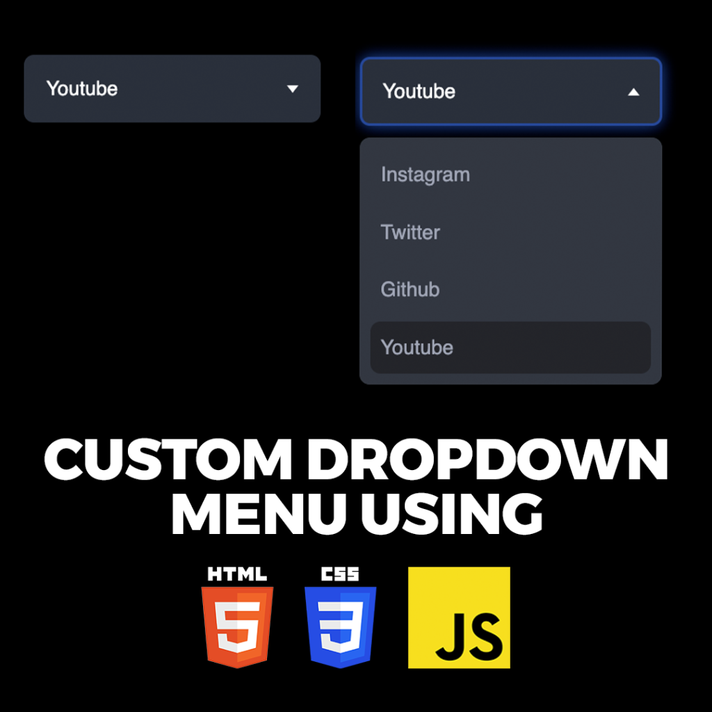
In web development, dropdown menus are a staple feature used to organize and navigate through content efficiently. In this blog post, we’ll walk through the process of creating a sleek and functional dropdown menu using HTML, CSS, and JavaScript. By the end of this tutorial, you’ll have a solid understanding of how to implement dropdown menus in your web projects to enhance user interaction and improve navigation.
Why Dropdown Menus Matter
Dropdown menus provide users with a compact and organized way to access additional options or navigate through a website’s content hierarchy. When designed effectively, dropdown menus can streamline the user experience, reduce clutter, and improve overall usability. By incorporating dropdown menus into your website, you can enhance navigation efficiency and make it easier for users to find what they’re looking for.
Creating a Dropdown Menu
Step 1: HTML Structure
<!DOCTYPE html>
<html lang="en">
<head>
<meta charset="UTF-8">
<meta name="viewport" content="width=device-width, initial-scale=1.0">
<title>Drop Down Menu</title>
<link rel="stylesheet" href="style.css">
</head>
<body>
<nav class="navbar">
<div class="logo">
<img src="https://www.wizbrand.com/assets/images/wiz.webp" alt="">
</div>
<div class="toggle-btn">
<div class="icon"></div>
</div>
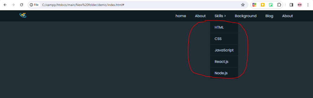
<ul class="menu">
<li><a href="#">Home</a></li>
<li><a href="#">About</a></li>
<li class="submenu-wrapper">
<a href="#">Skills<span> > </span>
</a>
<ul class="submenu">
<li><a href="#">HTML</a></li>
<li><a href="#">CSS</a></li>
<li><a href="#">JavaScript</a></li>
<li><a href="#">React.js</a></li>
<li><a href="#">Node.js</a></li>
</ul>
</li>
<li><a href="#">Wizbrand</a></li>
<li><a href="#">Blog</a></li>
<li><a href="#">About</a></li>
</ul>
</nav>
<script src="script.js"></script>
</body>
</html>Step 2: CSS Styling
@import url('https://fonts.googleapis.com/css2?family=Poppins:ital,wght@0,100;0,200;0,300;0,400;0,500;0,600;0,700;0,800;0,900;1,100;1,200;1,300;1,400;1,500;1,600;1,700;1,800;1,900&display=swap');

*,
::before,
::after{
    padding: 0;
    margin: 0;
    box-sizing: border-box;
}

html{
    font-size:13px;
}

body{
    font-family: "Poppins", sans-serif;
    font-size:1rem;
    background: #222f37;
    color:#d6e0f9;
}

.navbar{
    width:100%;
    position:fixed;
    top:0;
    left:0;
    background: #101d23;
    padding:0 5%;
    display:flex;
    align-items: center;
    justify-content: space-between;
}

.logo{
    width:5rem
}

.logo img{
    width:100%;
}

.menu{
    list-style: none;
}

.menu li{
    position: relative;
    float:left;
}

.menu li a{
    font-family: "Poppins", sans-serif;
    font-size:1.2rem;
    color:#d6e0f9;
    display:block;
    text-decoration: none;
    padding:1rem 1.5rem;
}

.menu li a:hover{
    background: #495ca8;
}

.submenu{
    position: absolute;
    left:0;
    background: #101d23;
    display:none;
    transition: all .3s ease-in-out;
}

.submenu-wrapper:hover .submenu,
.submenu-wrapper:focus-within .submenu{
    display: initial;
}

.submenu li{
    width:100%;
    border-top:.1rem solid #222f37;
    list-style: none;
}

.toggle-btn {
    display: none; /* Initially hide the toggle button */
    z-index:1000;
}

.icon {
    position: relative;
    width: 1.5rem;
    height: .8rem;
    cursor: pointer;
    z-index:100;
}

.icon::before {
    top: 0;
    right:0;
    content: '';
    position: absolute;
    width: 2rem;
    height: .2rem;
    background-color: #d6e0f9;
    transition: all 0.3s ease-in-out;
}

.icon::after {
    bottom: 0;
    right:0;
    content: '';
    position: absolute;
    width: 1.5rem;
    height: .2rem;
    background-color: #d6e0f9;
    transition: transform 0.3s ease-in-out;
}


.icon.active::before {
    width:1.5rem;
    transform: rotate(-45deg) translate(-0.21rem, 0.21rem);
}

.icon.active::after {
    transform: rotate(45deg) translate(-0.21rem, -0.21rem);
}


@media (max-width: 991px){
    .toggle-btn{
        display: block;
    }

    .menu{
        width:100%;
        position:absolute;
        top:100%;
        left:0;
        background: #101d23;
        border-top: .1rem solid #222f37;
        display:none;
    }

    .menu.active{
        display:initial
    }

    .menu li{
        width:100%;
        border-top: .1rem solid #222f37;
    }

    .submenu{
        position: relative;
        width:100%;
    }

    .submenu li{
        background: #222f37;
        border-top: .1rem solid #101d23;
    }

    .submenu li a{
        padding-left:2rem;
    }
}
Step 3: JavaScript Functionality
const icon = document.querySelector('.icon');
const menu = document.querySelector('.menu');
const span = document.querySelector('.span')

function toggleNavbar() {
    menu.classList.toggle('active');
    icon.classList.toggle('active');
}

document.querySelector('.toggle-btn').addEventListener('click', function () {
    toggleNavbar();
});
Output:-
Hopefully, It will help you …!!!