In the vast ocean of web design, there exists a technique that allows websites to transcend the ordinary and dive deep into creativity. This technique, metaphorically speaking, is akin to “punching through the surface,” breaking free from the constraints of conventional design and exploring new depths of creativity and innovation. In this blog post, we’ll embark on a journey to explore this concept further and uncover the potential it holds for creating engaging and memorable web experiences.
HTML Structure:
<!DOCTYPE html>
<html lang="en">
<head>
    <meta charset="UTF-8">
    <meta name="viewport" content="width=device-width, initial-scale=1.0">
    <title>Three Columns Layout - Wizbrand</title>
    <link rel="stylesheet" href="style.css">
</head>
<body>
    <div class="container">
        <div class="container">
            <div class="container">
                <div class="container">
                    <div class="surface">
                        <div class="hole"></div>
                    </div>
                 </div>
            </div>
        </div>
    </div>

</body>
</html>
CSS Structure:
.container {
padding: 28px;
width: 100%;
padding: 28px;
width: 100%;
background: blue;
}
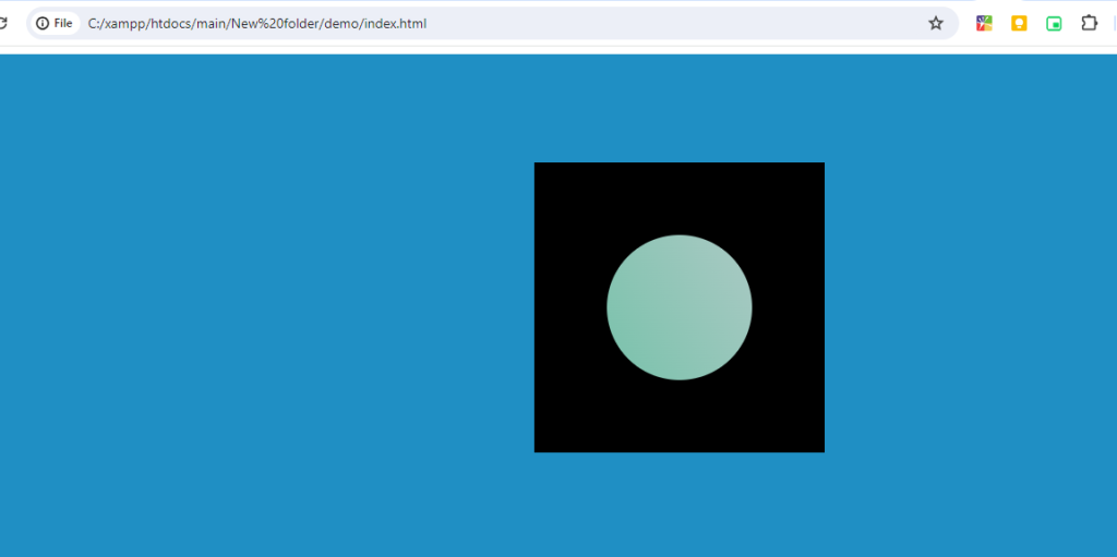
.surface {
display: flex;
justify-content: center;
align-items: center;
background-color: black;
width: 300px;
height: 300px;
margin: auto;
}
.hole {
height: 150px;
width: 150px;
border-radius: 50%;
height: 150px;
width: 150px;
border-radius: 50%;
background: linear-gradient(239deg,#387ba8 27.11%,#1eb47d 73.91%);
background-attachment: fixed;
}Output:-