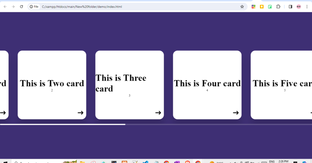
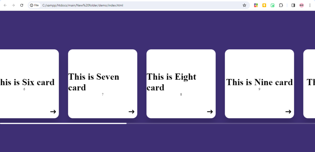
Creating a horizontal swiper using only HTML and CSS can be achieved using CSS Flexbox or CSS Grid for layout and CSS animations for the sliding effect.

Html Structure:-
<!DOCTYPE html>
<html lang="en">
  <head>
    <meta charset="UTF-8" />
    <meta name="viewport" content="width=device-width, initial-scale=1.0" />
    <title>Horizontal scroll only using html css</title>
    <link rel="stylesheet" href="style.css">
  </head>
  <body>
    <div class="container">
      <div class="slider-container">
        <div class="cards-holder">
          <div class="card">
            <div class="title">This is first card</div>
            <div class="subtitle">1</div>
            <span>➜ </span>
          </div>

          <div class="card">
            <div class="title">This is Two card</div>
            <div class="subtitle">2</div>
            <span>➜ </span>
          </div>

          <div class="card">
            <div class="title">This is Three card</div>
            <div class="subtitle">3</div>
            <span>➜ </span>
          </div>

          <div class="card">
            <div class="title">This is Four card</div>
            <div class="subtitle">4</div>
            <span>➜ </span>
          </div>

          <div class="card">
            <div class="title">This is Five card</div>
            <div class="subtitle">5</div>
            <span>➜ </span>
          </div>

          <div class="card">
            <div class="title">This is Six card</div>
            <div class="subtitle">6</div>
            <span>➜ </span>
          </div>

          <div class="card">
            <div class="title">This is Seven card</div>
            <div class="subtitle">7</div>
            <span>➜ </span>
          </div>

          <div class="card">
            <div class="title">This is Eight card</div>
            <div class="subtitle">8</div>
            <span>➜ </span>
          </div>

          <div class="card">
            <div class="title">This is Nine card</div>
            <div class="subtitle">9</div>
            <span>➜ </span>
          </div>

          <div class="card">
            <div class="title">This is Ten card</div>
            <div class="subtitle">10</div>
            <span>➜ </span>
          </div>
        </div>
      </div>
    </div>
  </body>
</html>
CSS Structure:-
body {
    width: 100%;
    height: 100vh;
    margin: 0;
    padding: 0;
    background: rgb(62, 47, 116);
  }
  .container {
    width: 100%;
    height: 100%;
    display: flex;
    align-items: center;
    justify-content: center;
  }
  .slider-container {
    width: 100%;
    height: fit-content;
    padding: 20px 0;
    overflow: auto;
  }
  .slider-container::-webkit-scrollbar {
    width: 80px;
    height: 5px;
  }
  .slider-container::-webkit-scrollbar-thumb {
    background: rgb(255, 255, 255);
    border-radius: 10px;
  }
  .slider-container::-webkit-scrollbar-track {
    background: rgba(224, 224, 224, 0.2);
  }

  .cards-holder {
    width: fit-content;
    display: flex;
    align-items: center;
    justify-content: center;
  }

  .card {
    width: 300px;
    height: 300px;
    background: white;
    box-shadow: 0 30px 30px rgba(0, 0, 0, 0.14);
    display: flex;
    align-items: center;
    justify-content: center;
    flex-direction: column;
    position: relative;
    margin: 0 20px;
    border-radius: 20px;
  }
  .title {
    font-size: 40px;
    font-weight: 600;
  }
  .subtitle {
    font-size: 14px;
  }
  .card span {
    position: absolute;
    bottom: 10px;
    right: 10px;
    font-size: 30px;
  }
  .cards-holder {
    width: fit-content;
    display: flex;
    align-items: center;
    justify-content: center;
    animation: scroll 10s linear infinite;
    }

    .card {
        width: 300px;
        height: 300px;
        background: white;
        box-shadow: 0 30px 30px rgba(0, 0, 0, 0.14);
        display: flex;
        align-items: center;
        justify-content: center;
        flex-direction: column;
        position: relative;
        margin: 0 20px;
        border-radius: 20px;
        /* animation: scroll 10s linear infinite; */
        /* YOU CAN ADD HERE AS WELL BASED ON REQUIREMENT */
      }

@keyframes scroll {
        0% {
          transform: translateX(0);
        }
        100% {
          transform: translateX(-100%);
        }
      }
Output:-
Hopefully, It will help you …!!!!