Introduction
Modern enterprise data architectures resemble massive, interconnected logistics networks. Raw data flows from thousands of transactional databases, third-party APIs, and cloud applications through complex ingestion, transformation, and storage layers before reaching its final destination. As businesses increasingly rely on machine learning models and automated analytics, the complexity of these pipelines escalates exponentially. Without complete visibility into these operations, data platforms operate in total darkness. Data teams frequently find themselves trapped in a reactive cycle, discovering pipeline failures only after compromised reports reach corporate executives. To establish absolute trust in data assets, organizations must implement comprehensive telemetry systems. This is where TheDataOps serves as a vital framework, helping enterprises transition from unstable, unmonitored workflows to highly predictable, observable infrastructure through the use of an enterprise-grade DataOps metrics dashboard.
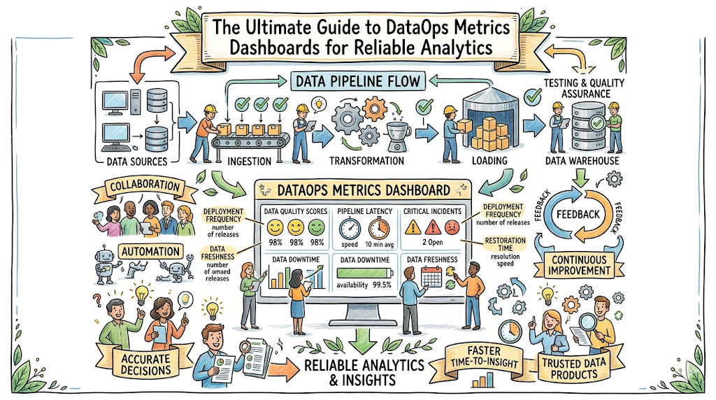
Understanding DataOps Metrics Dashboards
What Are DataOps Metrics Dashboards?
A DataOps metrics dashboard is a centralized operational console that visualizes the health, performance, quality, and cost of data management systems. Think of it as an aircraft cockpit for data operations. Just as a pilot relies on instruments to monitor altitude, fuel levels, and engine temperature, a data team uses this dashboard to monitor the status of complex ingestion routines, processing clusters, and analytical pipelines. It synthesizes raw system logs, execution metadata, and statistical data profiles into clean, actionable visualizations.
Why Metrics Matter in DataOps
You cannot manage what you do not measure. Without precise operational telemetry, data platforms suffer from silent degradation. Pipelines may continue to execute successfully while delivering empty, duplicated, or stale records to downstream users. Metrics establish an objective baseline of systemic behavior, converting ambiguous complaints like “the dashboard feels slow” into precise architectural challenges such as “95th-percentile query latency has increased by 450 milliseconds.”
Dashboard-Driven Data Reliability
Data reliability is not an accidental outcome; it is the product of deliberate engineering. Dashboard-driven operations change how engineers interact with infrastructure by organizing complex telemetry into a clear operational hierarchy. Instead of forcing team members to sift through disparate logs across various cloud systems, a single operational dashboard aggregates information to reveal the health of the entire environment at a glance.
+-----------------------------------------------------------------------+
|                       DataOps Dashboard Layers                        |
+-----------------------------------------------------------------------+
|  Executive Layer   -->  ROI, Global SLOs, Total Infrastructure Costs  |
|  Operational Layer -->  Pipeline Health, Freshness, Failures          |
|  Engineering Layer -->  Query Latency, Thread Count, Schema Drift    |
+-----------------------------------------------------------------------+
Role of Dashboards in Modern Data Operations
In a modern data ecosystem, dashboards act as the single source of truth for platform health. They bridge the gap between technical infrastructure teams and business stakeholders. By translating low-level execution states into high-level operational metrics, these consoles help ensure that everyone shares an accurate understanding of current data health.
In Simple Terms: A DataOps dashboard is a digital control panel that shows whether your business data is accurate, up-to-date, and moving smoothly through your systems. It catches hidden technical errors before they turn into major business mistakes.
Key Takeaways
- DataOps dashboards aggregate disparate metadata into a single, unified interface.
- Objective metrics replace guesswork with actionable, quantifiable engineering data.
- Operational visibility is essential for maintaining business trust in analytics platforms.
The Evolution of DataOps Observability
Traditional Data Monitoring
Early data management relied heavily on basic, reactive monitoring. This approach was limited to checking binary infrastructure states: whether a specific database server was online or if a scheduled cron job completed with a zero exit code. This methodology mirrors checking whether a manufacturing assembly line has power, without evaluating if the items being produced are structurally sound. It completely ignores internal data quality, schema mutations, and behavioral drift.
Modern Data Observability
Modern data observability expands beyond infrastructure monitoring by evaluating the internal health of data moving through pipelines. It relies on a comprehensive collection of metrics, logs, traces, and lineage information to reconstruct system behavior automatically. Rather than merely confirming that an ETL job completed, observability analyzes whether the volume of data matches historic expectations, if null values remain within acceptable tolerances, and how schema updates impact downstream assets.
From Reactive Monitoring to Proactive Operations
The transition from reactive monitoring to proactive operations shifts how engineering teams handle incidents. Instead of waiting for users to report broken dashboards, platforms use automated statistical anomalies to catch issues early.
| Operational Dimension | Traditional Data Monitoring | Modern Data Observability |
| Primary Focus | Server availability and job status | Data health, quality, and system behavior |
| Detection Method | Rule-based failures (e.g., Job Failed) | Algorithmic anomaly detection |
| Visibility Scope | Isolated infrastructure components | End-to-end data lineage and flow |
| Resolution Mode | Reactive triage after customer complaints | Proactive mitigation before data reaches users |
Dashboard-Centric Operations
By centering daily operations around an observability dashboard, teams can build a culture focused on systemic reliability. Engineers no longer spend mornings hunting down the source of corrupt metrics. Instead, the dashboard points directly to the exact pipeline stage where anomalies first appeared.
In Simple Terms: Traditional monitoring only checks if your data systems are turned on. Modern observability looks inside the system to ensure the data passing through is clean, correct, and safe to use.
Key Takeaways
- Traditional monitoring fails to detect internal data corruption or unexpected volume shifts.
- Observability combines metrics, logs, and lineage to provide systemic transparency.
- Proactive operations catch anomalies automatically before they disrupt business logic.
Core DataOps Metrics Every Dashboard Should Track
Pipeline Success Rate
- Definition: The percentage of scheduled pipeline executions that complete successfully without engineering intervention over a given period.
- Business Importance: Low success rates indicate unstable architecture, resulting in unpredictable downstream updates and high engineering fatigue.
- Measurement Approach: Calculated using the formula:$$\text{Success Rate} = \left( \frac{\text{Successful Executions}}{\text{Total Scheduled Executions}} \right) \times 100$$
- Common Thresholds: Production pipelines should target a minimum success rate of 99.5%.
- Dashboard Visualization Methods: A prominent single-value KPI block paired with a historical line chart to show performance trends over time.
Data Freshness
- Definition: The age of the most recent data record in a target system relative to the current time. This represents checking whether today’s newspaper is current.
- Business Importance: Stale data leads to outdated analytical insights, impacting time-sensitive financial trading or inventory decisions.
- Measurement Approach: Evaluated by querying the maximum timestamp in a table against the system time:$$\text{Freshness} = T_{\text{current}} – \max(T_{\text{record}})$$
- Common Thresholds: Critical operational tables typically require data freshness within 15 minutes; analytical warehouses may tolerate 24 hours.
- Dashboard Visualization Methods: A horizontal gauge chart that shifts from green to red as freshness approaches established thresholds.
Data Completeness
- Definition: A measure of whether expected volumes of data arrived during a processing window without missing records.
- Business Importance: Incomplete data causes reporting systems to underreport vital business metrics like daily revenue or user sign-ups.
- Measurement Approach: Compares current record counts against historical averages using statistical standard deviations.
- Common Thresholds: Volume deviations exceeding three standard deviations ($\pm 3\sigma$) from the historical mean should trigger warnings.
- Dashboard Visualization Methods: An area chart plotting current row counts against a shaded band representing historical expectations.
Data Quality Failure Rate
- Definition: The frequency with which incoming data violates formal business assertions, such as non-null rules, format constraints, or value ranges.
- Business Importance: High failure rates signal upstream source issues or deteriorating data cleanliness, which erodes user trust.
- Measurement Approach: Tracked by counting failed data quality assertions as a percentage of total checks run.
- Common Thresholds: Critical data quality failures should remain under 0.1% for core production tables.
- Dashboard Visualization Methods: A stacked bar chart breaking down failures by severity, rule category, and origin table.
Query Performance Metrics
- Definition: System execution profiles, specifically focusing on the 95th and 99th percentile execution times for analytical queries.
- Business Importance: Slow query performance degrades user experience on downstream applications and rapidly inflates compute bills.
- Measurement Approach: Extracted directly from warehouse metadata logs across specific query categories.
- Common Thresholds: Interactive BI queries should return results within 3 seconds at the 95th percentile.
- Dashboard Visualization Methods: A distribution histogram coupled with a trend line tracking long-tail latency.
Deployment Frequency
- Definition: The rate at which the data engineering team safely deploys new code changes, schema migrations, or transformations to production.
- Business Importance: Measures development agility and an organization’s capacity to deliver new data features to the market.
- Measurement Approach: Total code deployments to production counted on a weekly or monthly basis.
- Common Thresholds: High-performing teams aim for multiple production deployments per week.
- Dashboard Visualization Methods: A simple calendar heatmap highlighting deployment frequency and regularity.
Mean Time to Recovery (MTTR)
- Definition: The average time required for a data team to restore normal operations following an incident or pipeline failure.
- Business Importance: High MTTR causes prolonged data downtime, directly stalling business decision-making.
- Measurement Approach: The average duration from initial incident generation to verified platform resolution:$$\text{MTTR} = \frac{\sum (T_{\text{resolution}} – T_{\text{incident}})}{\text{Total Incidents}}$$
- Common Thresholds: Critical data paths should target an MTTR under 60 minutes.
- Dashboard Visualization Methods: A running average trend line accompanied by a list of recent incidents and their individual resolution times.
Alert Noise Ratio
- Definition: The percentage of automated notifications that do not require engineering intervention or fail to point to an actual issue.
- Business Importance: Excessive alert noise causes engineer burnout, leading teams to miss actual critical production failures.
- Measurement Approach: Tracked by logging how many generated alerts are closed without code or configuration updates.
- Common Thresholds: Teams should maintain an alert noise ratio below 15%.
- Dashboard Visualization Methods: A pie chart breaking down alerts into categories: Actionable, Informational, and False Positive.
Lineage Coverage
- Definition: The percentage of data assets within an environment whose end-to-end lineage is fully mapped and tracked. This mirrors tracing a package through every stage of delivery.
- Business Importance: Missing lineage complicates root-cause analysis, rendering compliance audits difficult and impact analysis unreliable.
- Measurement Approach: Calculated by dividing tracked assets within an enterprise data catalog by total discovered assets.
- Common Thresholds: Production tables and formal reports must maintain 100% lineage tracking.
- Dashboard Visualization Methods: A progress ring paired with an asset inventory checklist.
Cost Per Dataset
- Definition: The combined financial cost of compute, storage, and licensing resources required to build and maintain a specific dataset.
- Business Importance: Helps surface inefficient data pipelines and bloated queries that are spending unnecessary cloud budget.
- Measurement Approach: Aggregates cloud billing data by combining infrastructure tags, cluster execution times, and storage capacities.
- Common Thresholds: Costs should scale linearly with volume; sudden exponential growth indicates inefficient logic.
- Dashboard Visualization Methods: A treemap chart displaying costs across pipelines, highlighting the most expensive operations.
5-Layer Metrics Deep Dive
To understand how these metrics operate within a mature engineering environment, let us explore two core metrics using a 5-layer operational framework.
Data Freshness
- Definition: The duration since the latest record arrived in the target repository.
- Why It Matters: Outdated data leads to stale executive reports and inaccurate machine learning predictions, creating direct operational blind spots.
- Real-World Example: An executive opens an inventory visibility dashboard at 9:00 AM, but the underlying table has not ingestion-updated since noon yesterday due to a stuck authentication token.
- Common Issue When Ignored: Operations teams inadvertently order excess stock because warehouse records do not show that a large order left the facility that morning.
- DataOps Solution: Implement an automated freshness monitor that queries the maximum row timestamp every 15 minutes, alerting the platform team immediately if updates lag beyond 30 minutes.
Mean Time to Recovery (MTTR)
- Definition: The average time spent diagnosing, patching, and reprocessing data following a platform failure.
- Why It Matters: Prolonged data downtime stalls downstream systems and creates an expensive engineering backlog.
- Real-World Example: An unexpected upstream API update causes a transformation model to fail at 2:00 AM, but engineers do not identify and fix the issue until 2:00 PM.
- Common Issue When Ignored: Business groups stop trusting automated reports and begin building fragmented, shadow-IT data pipelines using manual spreadsheet exports.
- DataOps Solution: Use a centralized dashboard to track active issues, paired with direct links to system lineage, code definitions, and execution logs to accelerate debugging.
In Simple Terms: Core metrics tell you how fast your data arrives, how accurate it is, how much it costs to process, and how quickly your team can resolve technical issues when things break.
Key Takeaways
- Pipelines require both operational metrics (like success rate) and qualitative metrics (like freshness).
- High alert noise reduces team focus and directly increases systemic downtime.
- Tracking cloud costs per dataset ensures sustainable architecture scaling.
Understanding DataOps SLIs, SLOs, and KPIs
To manage data operations effectively, teams must categorize indicators into explicit, operational tiers. Mixing internal technical metrics with high-level business goals causes confusion and dilutes engineering focus.
Service Level Indicators (SLIs)
An SLI is a quantifiable, objective measure of a technical service’s performance. It represents a real-time snapshot of system behavior. SLIs form the foundation of telemetry, answering the basic question: “What is the system’s current performance?” Examples include the latency of a specific query or the exact freshness of a core table.
Service Level Objectives (SLOs)
An SLO is a formal, target reliability goal for an SLI over a specific time window. It defines the acceptable performance boundaries for engineering teams, balancing technical ideals with business realities. It answers the question: “How reliable does this system actually need to be to keep stakeholders satisfied?” An example would be requiring a table’s freshness SLI to remain under 15 minutes for 99.9% of executions each month.
Key Performance Indicators (KPIs)
A KPI is a high-level metric that reflects overall business success and strategic health. KPIs focus on commercial outcomes rather than technical implementation details. They answer the question: “How are our data systems impacting our bottom-line business goals?” Examples include overall customer retention rate, platform infrastructure ROI, or total data development velocity.
How They Work Together
These three layers form a continuous feedback loop that connects technical execution directly to commercial outcomes.
+-----------------------------------------------------------------------+
|                       Telemetry Alignment Loop                       |
+-----------------------------------------------------------------------+
|  SLI (Technical Metric)  --> Measures specific pipeline performance  |
|         ↓                                                             |
|  SLO (Reliability Target) --> Guarantees baseline stability levels    |
|         ↓                                                             |
|  KPI (Business Outcome)   --> Evaluates commercial impact and ROI     |
+-----------------------------------------------------------------------+
| Operational Layer | Target Audience | Primary Focus | Practical Example |
| SLI | On-Call Engineers | Low-level system performance | Row count deviation on ingestion |
| SLO | Engineering Managers | Reliability targets and budget | Ingestion volume within $\pm 2\sigma$ for 99% of days |
| KPI | Executive Leadership | Business health and financial growth | Quarter-over-quarter cost savings on infrastructure |
In Simple Terms: An SLI measures exactly how fast your car is driving right now. An SLO is the speed limit you agree to follow to stay safe. A KPI is whether you arrive at your destination on time.
Key Takeaways
- SLIs provide the real-time empirical measurements needed to evaluate system behavior.
- SLOs define acceptable boundaries, preventing costly over-engineering.
- KPIs align technical team metrics directly with high-level corporate strategies.
Types of DataOps Dashboards
Organizations require different operational views depending on individual roles and responsibilities. A single, generic layout cannot satisfy the distinct needs of an on-call engineer and a Chief Financial Officer.
                     +---------------------------+
                     |  DataOps Dashboard Suite  |
                     +---------------------------+
                                   |
         +-------------------------+-------------------------+
         |                                                   |
+------------------+                               +------------------+
|  Administrative  |                               |    Production    |
+------------------+                               +------------------+
         |                                                   |
         +---------> Executive Dashboards                    +---------> Operational Dashboards
         |                                                   |
         +---------> Engineering Dashboards                  +---------> On-Call Dashboards
Executive Dashboards
- Audience: Chief Data Officers, Chief Information Officers, and financial stakeholders.
- Purpose: To provide a high-level overview of ecosystem health, regulatory compliance, and cloud spend.
- Key Focus Areas: Global SLO compliance rates, platform adoption metrics, and month-over-month infrastructure costs.
Operational Dashboards
- Audience: Data Engineering Managers and Analytics Product Owners.
- Purpose: To track day-to-day data reliability and delivery schedules across production lines.
- Key Focus Areas: End-to-end data pipeline health, active data quality alerts, and downstream asset freshness.
Engineering Dashboards
- Audience: Data Engineers and Analytics Platform Architects.
- Purpose: To offer deep technical visibility into infrastructure performance and code deployments.
- Key Focus Areas: Container resource utilization, database query plans, worker pool bottlenecks, and deployment velocities.
On-Call Dashboards
- Audience: Site Reliability Engineers and rotating on-call data developers.
- Purpose: To accelerate incident triage and minimize time-to-resolution during platform failures.
- Key Focus Areas: Active high-severity alerts, infrastructure exceptions, error budgets, and direct lineage links.
In Simple Terms: Executives use dashboards to monitor budgets and high-level compliance. Managers use them to ensure daily project delivery. Engineers use them to optimize code, and on-call teams use them to fix broken systems quickly.
Key Takeaways
- Effective dashboard systems are tailored to the distinct needs of specific target audiences.
- Executive views focus on financial impact, whereas engineering views isolate technical bottlenecks.
- On-call dashboards require immediate context to keep recovery times minimal.
Data Quality Dashboards
A data pipeline can run efficiently while delivering broken data. Data quality dashboards act as continuous validation layers, ensuring data matches business rules before consumption.
Completeness Monitoring
Completeness monitoring ensures that no data drops or goes missing during processing. Dashboards monitor row counts across transformation stages, alerting teams if an step processes zero rows or suffers a drop in volume compared to historical baselines.
Accuracy Monitoring
Accuracy focuses on whether values are correct. This involves running automated business rules, such as verifying that transaction totals match individual line items or that field values conform to explicit formats.
Consistency Tracking
Consistency tracking ensures that data matches across distinct storage platforms. If a financial record in an operational PostgreSQL database shows one amount, the corresponding row in a Snowflake analytical warehouse must match exactly.
Schema Validation
Upstream application updates often change column names or data types without warning. Schema validation components track table structures in real time, alerting data teams the moment an unannounced column drop or data type change occurs.
Data Drift Detection
Data drift happens when the statistical properties of input data shift over time, even if formats remain correct. For instance, if a demographic column suddenly shifts from containing globally distributed addresses to only listing a single region, it can cause downstream machine learning models to fail.
+-------------------------------------------------------------------------+
|                        Data Quality Validation                          |
+-------------------------------------------------------------------------+
|  Ingested Raw Data                                                      |
|         │                                                               |
|         ▼                                                               |
|  [Completeness Check] ──► Checks row counts against historical norms    |
|         │                                                               |
|         ▼                                                               |
|  [Schema Validation]  ──► Confirms structures match expectations         |
|         │                                                               |
|         ▼                                                               |
|  [Accuracy Audit]     ──► Validates fields against strict constraints   |
|         │                                                               |
|         ▼                                                               |
|  Verified Clean Data Available for Consumption                          |
+-------------------------------------------------------------------------+
In Simple Terms: Data quality dashboards act like health inspectors for your data. They verify that files contain the expected number of records, use proper formatting, and do not contain corrupted information.
Key Takeaways
- Successful pipeline execution does not guarantee accurate internal data.
- Automated schema validation prevents upstream software updates from breaking warehouse tables.
- Tracking data drift protects downstream machine learning models from silent failure.
Pipeline Monitoring Dashboards
Pipeline monitoring focuses on tracking the processing engines that ingest, clean, and deliver corporate datasets. This mirrors monitoring a manufacturing assembly line.
ETL Performance
ETL dashboards monitor extraction, transformation, and loading performance. They track how long individual transformation steps take, highlighting steps that run slowly or cause resource queues.
Workflow Monitoring
Enterprise data relies on complicated execution schedules containing hundreds of interdependent tasks. Workflow monitoring visualizes these relationship graphs, mapping out task states so teams can see dependencies clearly.
Job Failure Tracking
When individual jobs fail, engineers need immediate insight into what went wrong. Job failure components isolate tasks that exited with errors, extracting the relevant stack traces and logs directly into the dashboard view.
Resource Utilization
Data pipelines use expensive cloud compute resources. Dashboards monitor CPU loads, RAM allocations, and network performance across processing nodes to ensure clusters are appropriately sized.
Processing Latency
Latency tracks the total time it takes for a single data record to pass through an entire data pipeline. Minimizing latency is crucial for streaming platforms that power live applications.
In Simple Terms: Pipeline monitoring acts like an inspection system for a physical factory line. It tracks how long jobs take, flags broken steps, and ensures the underlying servers are not overloaded.
Key Takeaways
- Workflow tracking visualizes execution dependencies to pinpoint systemic bottlenecks.
- Monitoring compute utilization helps protect platforms from unexpected cloud costs.
- Isolating task failures accelerates root-cause analysis during unexpected outages.
Analytics and BI Dashboard Metrics
The final step in any data pipeline is consumption via Business Intelligence tools. If the connection between warehouses and BI tools fails, the preceding infrastructure investment is lost.
Query Latency
Query latency measures how long an end user must wait for an interactive chart to update after clicking a filter. High latency frustrates business users and drives down adoption.
Dashboard Availability
Like any cloud application, internal business dashboards require explicit uptime tracking. Teams monitor access availability to ensure dashboards render successfully whenever business users request them.
User Adoption Metrics
Building beautiful dashboards is pointless if teams do not use them. Tracking user sign-ins, page views, and frequent queries helps teams identify which data assets provide clear value and which should be retired.
Business KPI Accuracy
Dashboards should cross-reference displayed metrics with underlying warehouse tables automatically. This validation step ensures that cache layers do not present outdated information to executive leadership.
Report Freshness
Report freshness tracks when a BI layout’s cache was last updated. If a report is built on top of real-time streaming data but the extraction layer updates only once a day, the report remains stale.
+-----------------------------------------------------------------------+
|                         BI Consumption Layer                          |
+-----------------------------------------------------------------------+
|  Data Warehouse  ──►  BI Cache Layer  ──►  User Analytics Console      |
|                             │                      │                  |
|                             ▼                      ▼                  |
|                    [Report Freshness]      [Query Latency]            |
+-----------------------------------------------------------------------+
In Simple Terms: This layer tracks how end users experience data reports. It measures whether charts load quickly, how often employees log in, and whether the displayed numbers match underlying databases.
Key Takeaways
- Slow report rendering directly hurts data adoption rates across business units.
- Tracking user behavior helps platform teams identify and retire unused reports.
- Automated caching layer audits prevent users from viewing stale business metrics.
Data Observability and Dashboard Design
Building a resilient DataOps metrics dashboard requires combining distinct data types into a single design. Relying on a single signal creates systemic blind spots.
- Metrics: Numerical representations of system performance measured over time. They provide the initial alert when anomalies occur.
- Logs: Highly detailed text descriptions of specific system events. They provide the deep context engineers need to diagnose why a component failed.
- Traces: End-to-end execution maps that track single transactional records across multiple infrastructure steps.
- Lineage: A visual graph illustrating how data assets relate to one another, showing how data moves from raw source files to final executive reports.
- Alerting: Automated notification rules that send messages to on-call engineers via platforms like Slack or PagerDuty when anomalies occur.
+-------------------------------------------------------------------------+
|                      Incident Resolution Workflow                       |
+-------------------------------------------------------------------------+
|  1. METRIC ALERT   ──► Flag: "Ingestion volumes dropped by 40%"         |
|         │                                                               |
|         ▼                                                               |
|  2. LINEAGE CHECK  ──► Trace upstream to locate the exact source table  |
|         │                                                               |
|         ▼                                                               |
|  3. LOG EXAM       ──► Identify error: "API connection timeout"          |
+-------------------------------------------------------------------------+
In Simple Terms: Metrics tell you that something is broken. Lineage shows you exactly where it is located. Logs explain why it broke, and alerts ensure engineers wake up to fix it.
Key Takeaways
- Combining metrics, logs, and lineage accelerates incident resolution.
- Lineage maps help engineers perform impact analysis before deploying code changes.
- Alerts must be tied to actionable metrics to prevent team burnout.
Best Tools Used for DataOps Dashboards
No single software package handles every aspect of DataOps telemetry. Successful architectures use combinations of specialized collection, storage, and visualization platforms.
Grafana
- Purpose: Highly flexible, real-time infrastructure and time-series visualization.
- Key Capabilities: Deep integration with time-series databases, dynamic alerting engines, and customizable dashboard panels.
- Best Use Cases: Monitoring live streaming applications, server clusters, and pipeline task latencies.
- Strengths & Limitations: Excellent for high-frequency infrastructure telemetry, but lacks native business intelligence data grouping features.
Prometheus
- Purpose: Open-source time-series metric collection and data alerting engine.
- Key Capabilities: A powerful metric query language (PromQL) and a pull-based data architecture.
- Best Use Cases: Serving as the central storage backend for Kubernetes clusters and pipeline engine logs.
- Strengths & Limitations: Highly scalable for numeric metrics, but cannot store raw unstructured text logs or complex system lineage.
Datadog
- Purpose: Unified, cloud-native observability and system monitoring platform.
- Key Capabilities: Full-stack integration combining application performance monitoring, log analytics, and dashboard capabilities.
- Best Use Cases: Enterprise ecosystems requiring a single, managed platform for all application monitoring.
- Strengths & Limitations: Out-of-the-box integrations save setup time, but licensing costs scale rapidly with data volume.
Looker
- Purpose: Enterprise business intelligence and data exploration platform.
- Key Capabilities: A centralized modeling layer (LookML) that ensures consistent metric definitions across an organization.
- Best Use Cases: Serving as the primary data visualization portal for business groups and executives.
- Strengths & Limitations: Guarantees metric consistency across dashboards, but is not designed to handle real-time server monitoring.
Tableau
- Purpose: Advanced data visualization and analytical business intelligence tool.
- Key Capabilities: Robust graphical rendering engine capable of creating deep analytical dashboards.
- Best Use Cases: Presenting complex historical analyses and cross-departmental business reports.
- Strengths & Limitations: Offers exceptional visualization flexibility, but requires deliberate optimization to prevent slow dashboard loading times.
Power BI
- Purpose: Microsoft ecosystem business intelligence and reporting application.
- Key Capabilities: Seamless integration with Azure infrastructure and native data preparation features.
- Best Use Cases: Enterprise organizations that standardize operations around the Microsoft product stack.
- Strengths & Limitations: Highly cost-effective for enterprise deployment, but can experience performance lag with exceptionally large datasets.
Great Expectations
- Purpose: Open-source data profiling and quality assertion framework.
- Key Capabilities: Code-driven definitions for checking data conditions, paired with automated documentation rendering.
- Best Use Cases: Validating data cleanliness within ingestion pipelines before records load into warehouses.
- Strengths & Limitations: Exceptional for testing data quality, but requires a separate visualization layer to display historical failure trends.
Airflow Monitoring
- Purpose: Visualizing orchestrator workflows and task execution metrics.
- Key Capabilities: Built-in graphical views showing task execution statuses, historical durations, and dependency paths.
- Best Use Cases: Tracking daily task dependencies, scheduling constraints, and pipeline failure points.
- Strengths & Limitations: Excellent for orchestrator status tracking, but does not monitor individual values or data quality within tables.
Real-World DataOps Dashboard Use Cases
E-Commerce Analytics
- Challenge: A retail enterprise experienced silent ingestion dropouts during peak holiday sales, resulting in missing order histories and inaccurate inventory reports.
- Metrics Monitored: Ingestion row volumes, checkout message queues, and payment table data completeness.
- Dashboard Design: Real-time operational boards showing live orders against a shaded historical baseline, paired with immediate error alerting.
- Business Outcome: Prevented inventory shortages by dropping data resolution times from 14 hours down to less than 10 minutes.
Financial Reporting
- Challenge: A financial firm discovered that ledger data type variations were causing calculation mismatches in end-of-month regulatory reports.
- Metrics Monitored: Column structure states, row-level null ratios, and cross-platform consistency metrics.
- Dashboard Design: A specialized data quality board that flags schema mutations and highlights balance sheet validation errors.
- Business Outcome: Eliminated compliance reporting delays, ensuring 100% data consistency across production systems.
Healthcare Data Pipelines
- Challenge: Patient data feeds from distributed clinics arrived with inconsistent formatting, causing downstream diagnostic applications to fail.
- Metrics Monitored: Format compliance rates, data drift patterns, and ingestion pipeline latencies.
- Dashboard Design: Engineering monitors that highlight row-level validation errors and catch formatting changes automatically.
- Business Outcome: Assured continuous availability for diagnostic models, protecting critical patient care timelines.
SaaS Product Analytics
- Challenge: A cloud software provider experienced high user churn because active dashboards rendered slowly during peak work hours.
- Metrics Monitored: 95th-percentile query execution latency, cache hit ratios, and active user traffic.
- Dashboard Design: An engineering performance dashboard displaying slow database queries alongside infrastructure resource limits.
- Business Outcome: Cut query latency times by 65%, significantly increasing customer satisfaction and user retention.
Customer Intelligence Platforms
- Challenge: Marketing automation workflows routinely failed because customer sync pipelines delivered duplicate records.
- Metrics Monitored: Duplicate record rates, primary key uniqueness, and table sync times.
- Dashboard Design: Operational control boards tracking synchronization health and flagging high duplicate rates.
- Business Outcome: Eliminated redundant marketing emails, ensuring high accuracy across sales targeting campaigns.
Common Dashboard Mistakes
Tracking Too Many Metrics
- The Issue: Flooding a dashboard with hundreds of low-level data points creates an unhelpful wall of metrics, making it difficult to spot actual problems.
- The Solution: Standardize designs around the core metrics that directly reflect pipeline health, moving technical details to deeper engineering views.
Ignoring Data Freshness
- The Issue: Displaying clean charts without indicating when the underlying data was last updated can lead teams to make decisions based on stale information.
- The Solution: Add a prominent “Last Updated” timestamp to every dashboard view, turning components red if updates stall.
Poor Alert Design
- The Issue: Setting overly restrictive alert rules triggers constant non-actionable notifications, causing team burnout and leading engineers to ignore serious issues.
- The Solution: Set alert triggers based on statistical anomalies rather than static numbers, routing only critical issues directly to on-call engineers.
Missing Ownership
- The Issue: When a dashboard component flags a data failure but no explicit team owns that dataset, the issue sits unresolved indefinitely.
- The Solution: Document explicit operational owners directly within dashboard metadata, routing failures automatically to the responsible engineers.
Lack of Business Context
- The Issue: Displaying infrastructure metrics without showing how they relate to business goals makes it difficult for leaders to understand the impact of data errors.
- The Solution: Connect technical metrics directly to business outcomes, demonstrating how system failures impact operational targets.
Best Practices for DataOps Dashboards
To build a reliable data operations framework, implement these architectural rules:
- Focus on Actionable Metrics: Every component on a dashboard must map directly to a clear engineering or business action. If a metric cannot be acted upon, remove it.
- Define Clear Ownership: Ensure every database table, workflow step, and report has a designated team owner responsible for resolving failures.
- Establish SLOs: Work closely with business groups to define realistic reliability goals, protecting engineering teams from unnecessary over-engineering.
- Reduce Alert Noise: Routinely review notification channels to filter out low-priority alerts, ensuring on-call teams stay focused on critical system issues.
- Automate Reporting: Connect telemetry tracking directly into automated systems, reducing manual status reporting work for engineering managers.
- Continuously Improve Dashboards: Update monitoring layouts regularly based on past system failures, ensuring visibility keeps pace with platform changes.
The Future of DataOps Dashboards
AI-Driven Observability
As data ecosystems expand, manually managing monitoring rules becomes impossible. Future observability platforms will use machine learning to map system dependencies automatically, adapting threshold rules without human configuration.
Predictive Data Operations
Future dashboards will transition from displaying historical failures to predicting future bottlenecks. By analyzing historical processing patterns and system loads, platforms will warn engineers about upcoming resource shortages before they cause outages.
Automated Incident Detection
Instead of simply alerting engineers to a problem, modern systems will automatically isolate root causes. Platforms will correlate pipeline failures with recent code updates, pointing developers directly to the breaking line of code.
Self-Healing Data Pipelines
The ultimate evolution of DataOps is the self-healing pipeline. When an ingestion failure or bad data record occurs, the system will automatically isolate corrupted rows, roll back broken schema updates, and scale compute resources without human intervention.
+-------------------------------------------------------------------------+
|                          Self-Healing Lifecycle                         |
+-------------------------------------------------------------------------+
|  1. ANOMALY REACHED  ──► Ingestion system detects a sudden schema drift |
|         │                                                               |
|         ▼                                                               |
|  2. AUTO-ISOLATION   ──► System routes broken records to quarantine     |
|         │                                                               |
|         ▼                                                               |
|  3. ALERT & REPAIR   ──► Platform self-heals while notifying the team   |
+-------------------------------------------------------------------------+
Real-Time Operational Intelligence
Data monitoring will shift from isolated infrastructure dashboards into real-time business operation hubs. This alignment ensures that data health insights are woven directly into every strategic enterprise initiative.
In Simple Terms: The future of data operations is self-correcting automation. Dashboards will evolve from tracking past technical failures to predicting problems and fixing code issues automatically before humans notice.
Key Takeaways
- Machine learning models will eliminate the need to configure manual threshold rules.
- Predictive observability allows teams to fix resource shortages before outages occur.
- Self-healing automation safely quarantines bad data without halting production lines.
FAQ Section
What is the difference between data monitoring and data observability?
Data monitoring tracks binary infrastructure states, such as whether a specific database server is online or if a workflow finished executing. Data observability looks deeper into the system, analyzing internal data values, volumes, schema mutations, and historical anomalies to assess overall platform health.
How often should DataOps metrics dashboards update?
Update frequencies should match the business speed of the underlying pipeline. Streaming environments require real-time dashboard updates every few seconds, whereas historical analytical warehouses typically update hourly or daily.
Who is responsible for building and maintaining DataOps dashboards?
Data engineers, DataOps architects, and platform reliability teams typically build and maintain these consoles. However, analytics engineers and business teams frequently collaborate to design the data quality rules that power the views.
How can our team reduce alert noise on our operational dashboards?
Teams can reduce alert noise by replacing rigid, manual thresholds with automated statistical anomaly rules. Additionally, filter out non-actionable notifications and ensure that only high-severity system failures route directly to on-call channels.
Should business users have access to DataOps metrics dashboards?
Yes, business users should have access to high-level operational and quality dashboards. Providing visibility into data freshness and accuracy builds organizational trust and prevents teams from making decisions using broken data.
What is an error budget and how does it relate to DataOps SLOs?
An error budget represents the acceptable amount of system unreliability a pipeline can experience before impacting business goals. It is calculated as the inverse of your SLO target, helping balance feature velocity with platform stability.
How do you monitor data pipelines that ingest unstructured data formats?
Unstructured pipelines are monitored by tracking file ingestion counts, byte delivery speeds, metadata structures, and down-stream transformation failure rates rather than evaluating cell-level field values.
Can open-source software tools build an enterprise-grade DataOps dashboard?
Yes, combining open-source tools like Prometheus for metric collection, Grafana for user visualization, and Great Expectations for quality validation creates a highly scalable, cost-effective enterprise platform.
How does data lineage tracking fit into an operational dashboard layout?
Data lineage functions as an interactive navigation map. When a dashboard flags a data quality failure, engineers use the lineage graph to retrace steps upstream to find the source error.
What should a data team do immediately when an SLO is violated?
When an error budget is exhausted or an SLO is violated, teams should temporarily pause new feature developments. Shift engineering focus toward improving pipeline architecture, fixing bugs, and restoring platform stability.
Final Summary
Achieving long-term data reliability requires a commitment to continuous measurement and systemic visibility. Without dedicated DataOps metrics dashboards, modern data platforms remain highly vulnerable to hidden data corruption, silent source modifications, and sudden pipeline failures that undermine business confidence.
By deploying comprehensive observability suites, organizations can confidently track pipeline success metrics, evaluate data freshness, and continuously audit data quality. Organizing operations around clear SLI, SLO, and KPI frameworks helps ensure that engineering actions stay aligned with overarching corporate strategies. Whether deploying open-source components or full enterprise observability systems, the goal remains identical: transform data infrastructure into a highly visible, predictable engine.